Working with Indian ink has vast possibilities for expression. One of my favourite ways to work with ink brings the two opposing sides of the medium, line and smooth tonal gradients, together in one picture. The specificity of a line compared to a soft gradation can feel different, with the line being more of a confinement to the figure.
By promoting variation in the thickness of the line and following the rhythm of your hatching lines into the brushstroke application of ink wash, you can create stronger unity. Have a go now with this tutorial and see how creative you can be.
In terms of art supplies, for this tutorial you'll need some waterproof Indian ink, a H or 2H pencil, metal nibs and some watercolour paper. You may need one of the best easels too.
01. Establish a sketch

Establish a rough sketch of your subject. For the fox, I am being loose and using gestural lines with some underlying geometric structure. I make sure to create interesting negative space and avoid concealing any important characteristics of the back leg with the overlaps.
02. Lay in the outlines

After lightly tracing my sketch onto the final watercolour paper with a H or 2H pencil, I begin the inking process. Using metal nibs and a bottle of waterproof Indian ink, I lay down the outlines and some early details. Variations in thick and thin can promote a sense of light or strengthen the feeling of overlap.
Let the ink lines completely dry before beginning the next step, or they may bleed unexpectedly with the application of ink wash. You'll need a bit of patience here.
03. Wash in a base

This step establishes the local values of your figure. In this instance, I am working with three values and simple gradients. Tilt your drawing surface so that gravity will pull the wash downward as you work.
I leave the paper untouched for highlights and the white fur on the fox. I tone everything else with a light midtone to establish the body’s colour. To achieve a soft edge, the area is brushed with clean water and painted into with the ink wash. After the first wash layer is dry, the legs and a few other spots on the head receive the darkest value.
04. Add shadows
Once the local values are defined, I model the light and shadow across the fox. Imagining a light source from above, the form relies on seeing the geometric shapes within the figure. Save the local colour from the previous step as the brightest part of the leg and turn the form by making the planes that face away from the light source a little darker.
The loosely washed-in background is used to create a changing value contrast with the figure called counterchange. The gradient allows the head and legs to be darker than the background, while the tail and back are brighter, giving 3D form and movement.
05. Hatch in ink
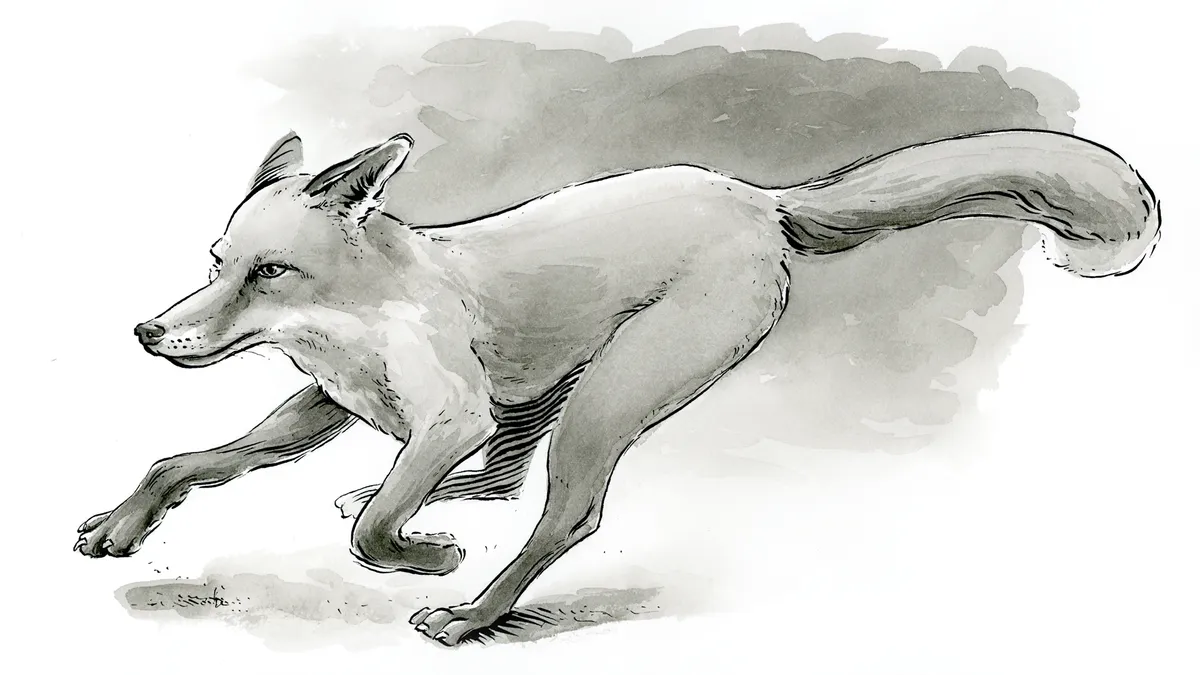
The final step helps to integrate the hatching ink lines with the soft gradients of the ink wash. Using the brush like a nib to create lines and shapes with grey tones I add fur texture and smaller marks to develop more character to the forms. Some areas are darkened with final adjustments to the value contrast.
Finally, I bring the pen nib back to enhance a few spots and introduce some spontaneous marks or lines as texture. These marks are like personal handwriting, so add them to taste!
This content originally appeared in Paint & Draw: Animals. Buy the bookazine at Magazines Direct.